Whiteboard & Diagram Craft
The diagram is not the deliverable
Two engineers can produce the same architecture and only one of them can be followed. That's not an aesthetic problem — nobody is scoring your handwriting — and it isn't fixed by drawing more carefully.
The useful reframe is this: the diagram is a shared thinking surface, not an artifact you hand in. It has exactly two jobs. It holds state so your working memory doesn't have to, and it gives two people something to point at and be sure they mean the same thing.
So the test for every choice in this lesson isn't does this look good. It's:
Can we both point at this and mean the same thing?
Which makes the real failure ambiguity, not ugliness. An ambiguous diagram doesn't produce a confused silence — it produces a confident conversation in which you and the interviewer are discussing two different systems, and neither of you finds out for several minutes.
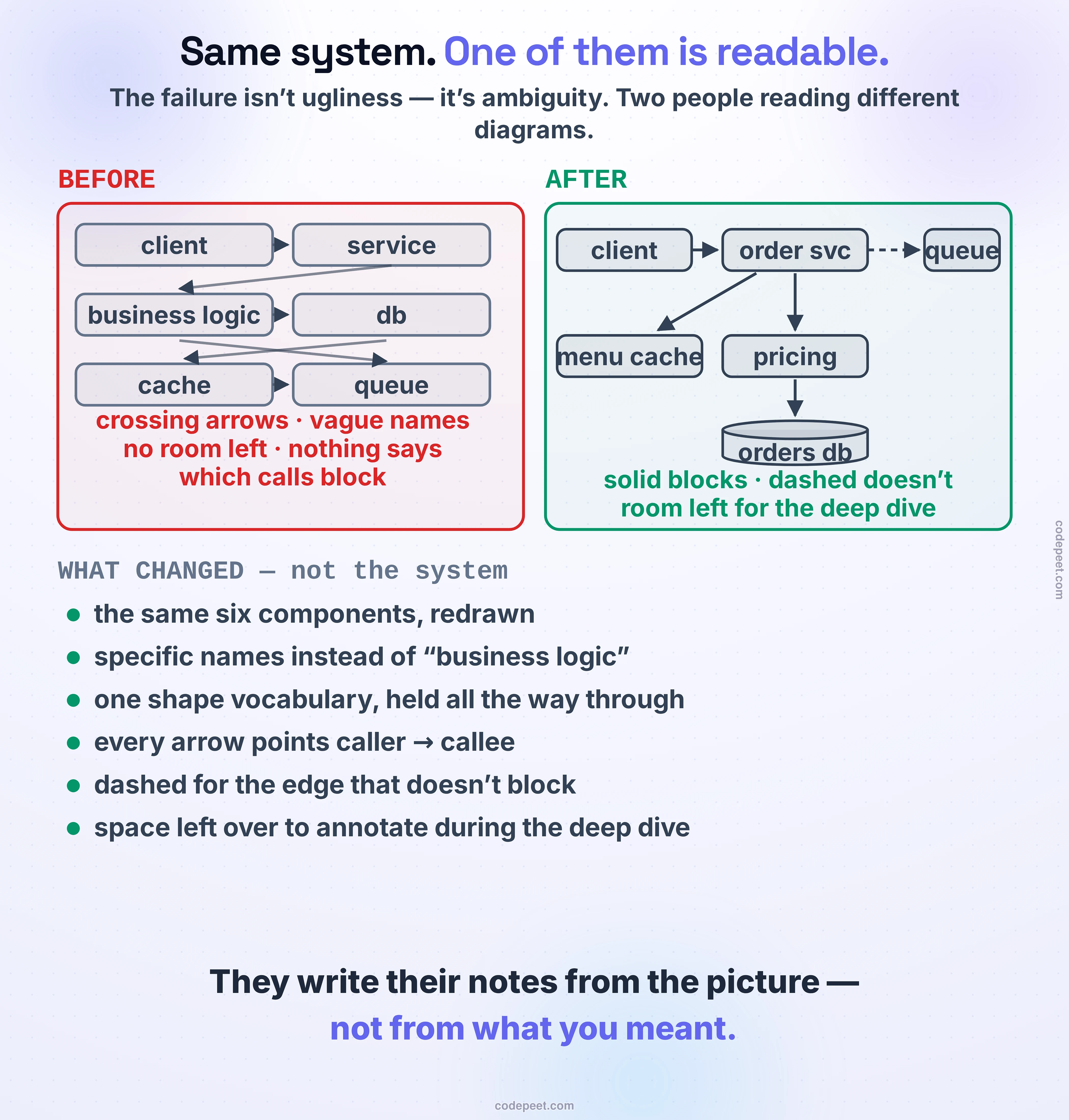
Nothing about the system changed between those two pictures. Same six components, same relationships. What changed is whether a second person can read it — and that matters more than it sounds, because the interviewer writes their feedback from the picture, not from your intentions. Communicating While Designing was about making your reasoning audible; this one is about not burying it under a diagram nobody can parse.
Your arrows mean three different things
Here's the part almost nobody teaches, and it's the single biggest upgrade available.
An arrow between two boxes can mean three different things:
- Dependency — which component relies on the other
- Control flow — which component initiates the connection
- Data flow — which way the bytes actually move
Most of the time you get away with this, because for a simple call all three agree. Then you draw a service reading from a database, and they don't.
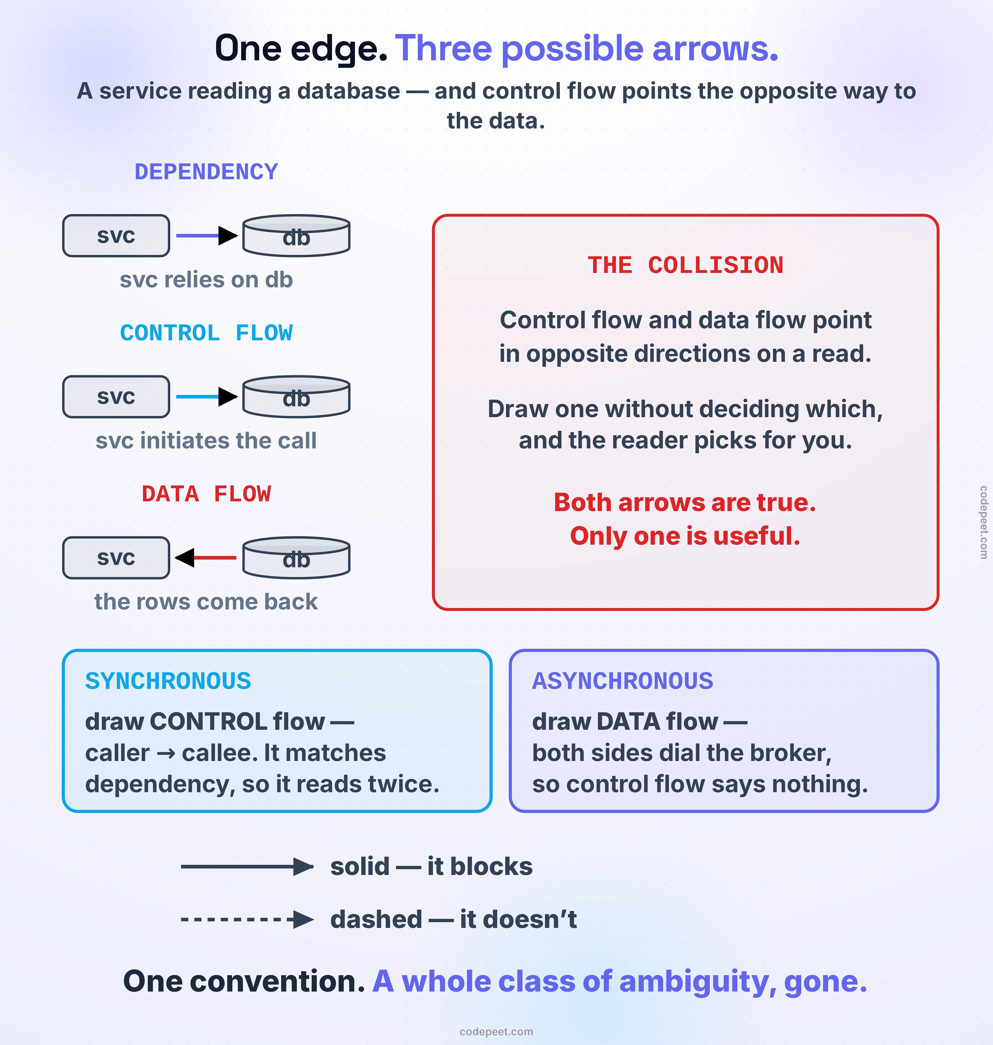
On a read, control flow and data flow point in opposite directions. The service calls the database; the rows come back. Both arrows are true. Draw one without deciding which you meant and the reader supplies their own answer.
There are two rules, and between them they cover everything you'll draw:
Synchronous → draw control flow. Point the arrow from caller to callee. This is the one that also matches dependency, so the picture says the same thing twice instead of two things once. It holds for anything request/response — a REST call, a query, a remote procedure call. Drawing the response arrow instead reads badly for a specific reason: the database neither connects to nor depends on the service, so an arrow pointing that way quietly claims something false.
Asynchronous → draw data flow. Here control flow stops being useful, because the producer and the consumer both dial the broker. Control-flow arrows would point inward from both sides and tell you nothing about how work moves. So follow the messages instead: producer → queue → worker.
And one convention that costs nothing and removes a whole class of ambiguity:
Solid means it blocks. Dashed means it doesn't.
Now a reader knows which calls are on the critical path before they have to ask — and when you say "this part is async so the write path doesn't wait," the picture already agreed with you.
Read your own diagram back
The trouble with arrow direction is that a wrong arrow doesn't look wrong. The diagram stays tidy and the mistake is entirely in what it claims.
So below is a small architecture with five edges, and you set the direction and line style on each one. As you do, the panel translates your picture back into plain English — the sentence a reader would take from it. Flip the database read around and watch it say "the orders database calls the order service." That is what a wrong arrow sounds like out loud, and it's the reason this is worth practising once rather than reading about twice.
Two of the five edges are the classic traps. There's also a whole-diagram check that catches something individual edges can't: mixing conventions halfway through.
Shapes are a tiny alphabet
After arrows, shapes are almost an anticlimax — because the correct answer is use very few and never vary them.
- Rectangle — a service, a process, anything that runs code
- Cylinder — a datastore
- Cloud or a plain box on the edge — something outside your system
That's essentially the whole vocabulary, and it's enough. The reason to keep it small is blunt: if you've labelled everything, the shape is decoration. Inventing a distinct shape for a cache, a queue, a load balancer and a search index doesn't add information — it adds a legend the reader has to learn while also trying to follow your design.
What genuinely matters is consistency. Pick your handful of shapes and hold them for the whole board. A rectangle that means "service" in one corner and "data store" in another is worse than having no convention at all, because the reader has already trusted the first one.
Colour: use less than you think. A diagram in one colour with good labels is completely readable. Reach for a second colour only to mark something specific — the hot path, the component you're about to open up — and then say what it means.
Labels that carry their weight
Label every box. Label the connections whenever the relationship isn't obvious from context — what protocol, what's on the wire, what the trigger is.
But the rule that actually changes diagrams is about which words. These labels are worth nothing:
business logic · integration logic · processing · handler · manager · service
They have no self-descriptive power — they're the diagram equivalent of a variable called data. Compare business logic with order validation & pricing. The second one took two extra seconds and told the interviewer what the box is for, which is the only reason it's on the board.
Same for acronyms. If it isn't universal, expand it once.
And the reason all this matters more than it seems: anything the diagram doesn't say is missing. You explained it beautifully out loud, but the written feedback gets composed from the board, sometimes after you've left the call. A box labelled service is a box that contributes nothing to the record of what you designed.
Space, and one level at a time
Two layout habits do most of the work, and both are about what happens later in the interview rather than right now.
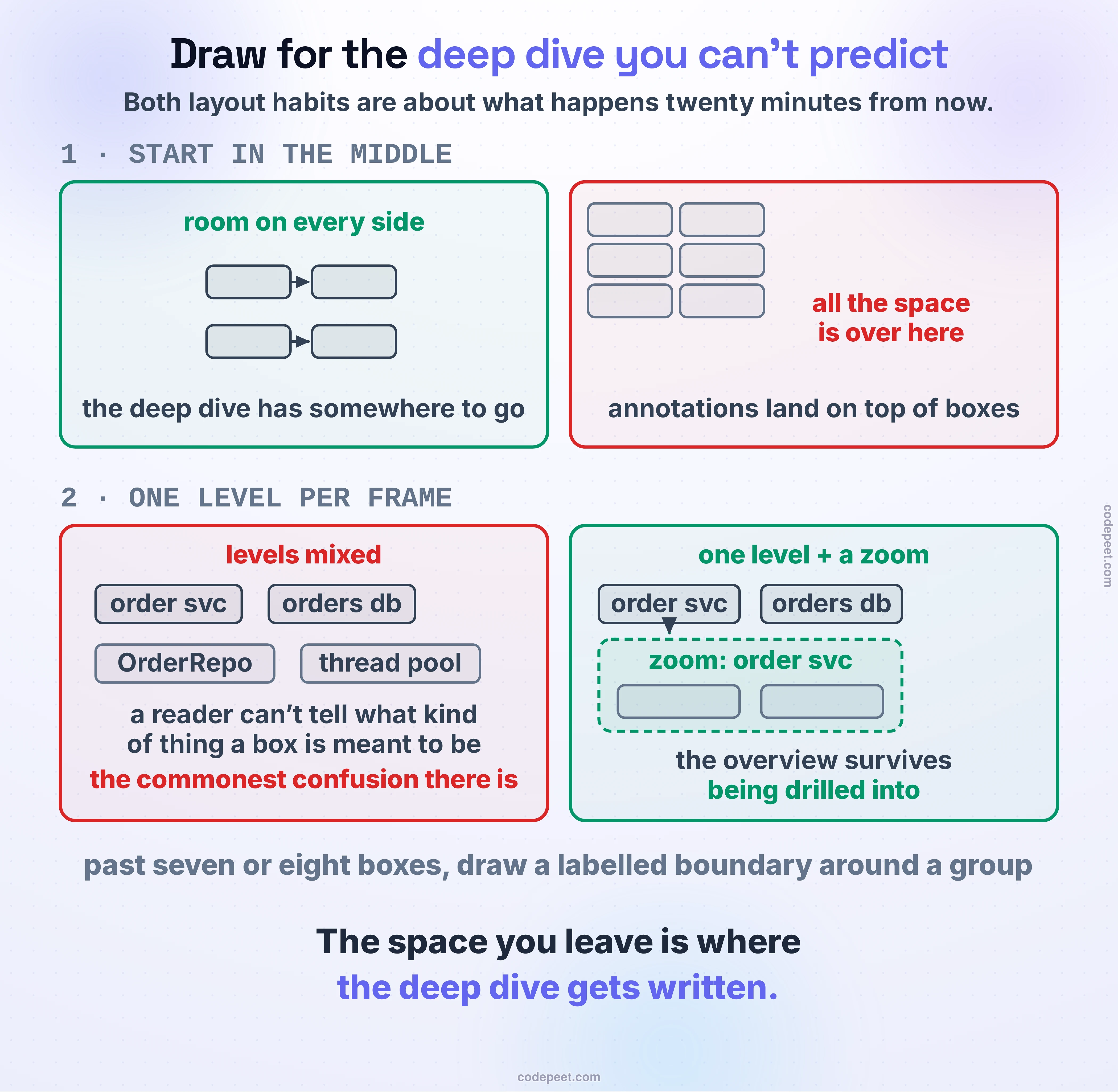
Start in the middle and work outward. You do not know yet which component the deep dive will open — that's often the interviewer's choice — and there is very little slack in the clock for re-laying-out a diagram. Components pushed into the top-left corner mean the deep dive has nowhere to go and your annotations end up written on top of existing boxes.
Leave real gaps between boxes. That space isn't waste; it's where the deep dive gets written — the replica count, the partition key, the retry policy, the thing the interviewer just asked about.
Keep one abstraction level per picture. Mixing them is the most common source of confusion in any architecture diagram: a service box next to a class name next to a thread pool leaves the reader unable to tell what kind of thing a box is meant to be.
So when the deep dive arrives, zoom rather than cram. Draw the internals of that one component in a fresh frame beside the high-level design instead of stuffing detail into the existing box. Your overview survives being drilled into, and — usefully — you can point at both at once when you explain how the piece fits back into the whole.
When the picture grows past roughly seven or eight boxes, draw a boundary around related components and label the group. One outlined region called order pipeline turns four boxes into one thing the reader can hold in their head.
Erase it
This one is counterintuitive enough to be worth stating on its own, because almost everyone gets it backwards.
You draw a component. Four minutes later you realise it was the wrong call. The instinct is to leave it there and work around it, because deleting feels like admitting a mistake in front of someone who is evaluating you.
Erase it. Two reasons, and both are strong.
First, noticing is the signal. Catching your own error and correcting it is the behaviour being assessed — it's the same coachability the previous lesson was about, just applied to your own work instead of the interviewer's hint.
Second, and more practically: a board that still shows your abandoned idea will be read as your design. Whoever writes the feedback — possibly reviewing a screenshot later — has no way to know which boxes you disowned. The wrong component sitting quietly in the corner is not neutral. It's part of what you submitted.
Say it as you do it, in about four words: "actually, let me pull that out — it doesn't earn its place now that we're caching." Now the erasure is visibly a decision rather than a correction.
What a readable diagram buys you
None of this is scored directly. There's no diagram-quality line on the rubric, and nobody gets hired for tidy rectangles.
What a readable diagram does is stop everything else from leaking. Your judgment shows up in the components you chose; your depth shows up in the one you opened; your communication is carried by a picture you're both pointing at. Every one of those is transmitted through the drawing, and an unreadable drawing attenuates all of them at once.
And there's a second payoff that's easy to miss. A clear diagram is a better thinking tool. When the boxes are spaced and the arrows say who calls whom, you can see the single point of failure, the synchronous chain that's three hops deep, the component everything depends on. Candidates with clean boards spot their own bottlenecks — not because they're smarter, but because the picture is doing part of the thinking for them. That's what boxes that help you think actually means.
So: decide what your arrows mean and be consistent. Solid blocks, dashed doesn't. Three shapes, held all the way through. Labels that say what a thing is for. Start in the middle, leave room for the deep dive, keep one level per frame, and erase what you've abandoned.
You now have the clock, the board, the voice, and the picture — the whole method. What's left are the questions everyone still has at this point, the ones that keep people up the night before: how much detail is enough, what to do about a technology you've never used, whether the numbers have to be right. That's The Questions Everyone Asks, next.