The Design Template
The best and the worst advice
There are two pieces of advice about system design interviews that are both extremely common and flatly contradictory.
"Have a template. Know exactly what goes on the board."
"Templates are why people fail. Interviewers can spot a memorized architecture instantly."
Both are true. Someone wrote an entire post titled I spent six months memorizing system design templates before realizing I should learn trade-offs instead — and they weren't wrong. But the candidate with no structure at all doesn't beat them; that candidate freezes at minute three and forgets to define an API.
The contradiction dissolves the moment you're precise about what a template fixes.
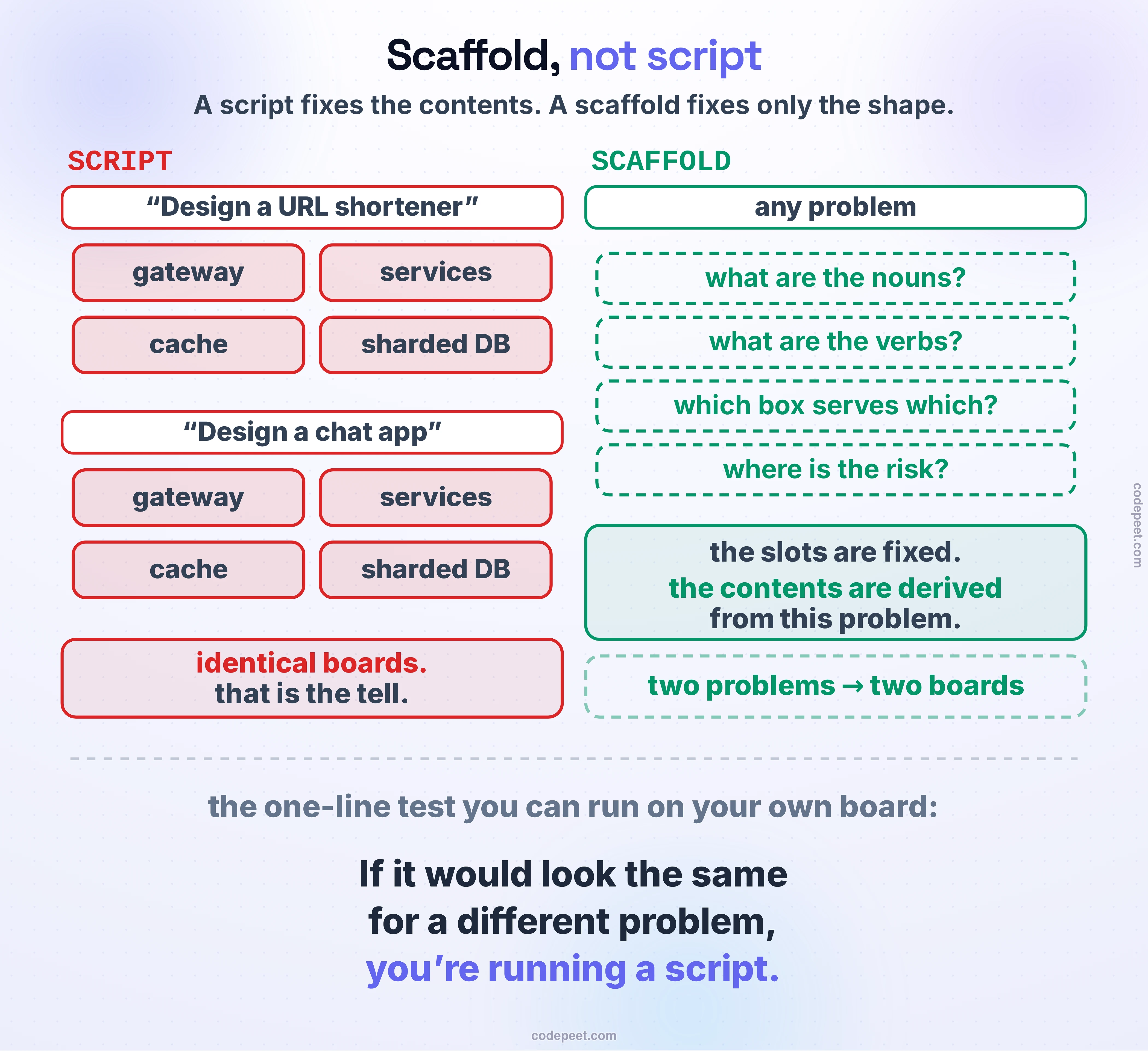
A script fixes the contents. A scaffold fixes the shape.
If your template says "gateway, service tier, cache, sharded database" — that's a script. You've pre-decided the answer, and you'll produce it whether or not the problem asked for it.
If your template says "there is a place here for the things this system is made of, and whatever goes there must come from the requirements" — that's a scaffold. It has decided nothing about the design. It has only decided where you'll put things and what order you'll think in.
And there's a single, brutal test for which one you're carrying:
If your board would look the same for two different problems, you're running a script.
Everything in this lesson is built to be a scaffold. The slots are fixed. The contents are always, always derived.
The board is a workspace, not a scroll
Before the artifacts, the real estate — because most candidates never think about it at all and it costs them the whole interview.
The instinct is to treat the canvas like a document: start at the top, work down, keep scrolling. Twenty minutes later the requirements are somewhere off-screen, the interviewer asks "remind me why you need the cache?", and you're scrolling around looking for the thing you agreed to. That's a small disaster made entirely of layout.
A board is a workspace with durable places.
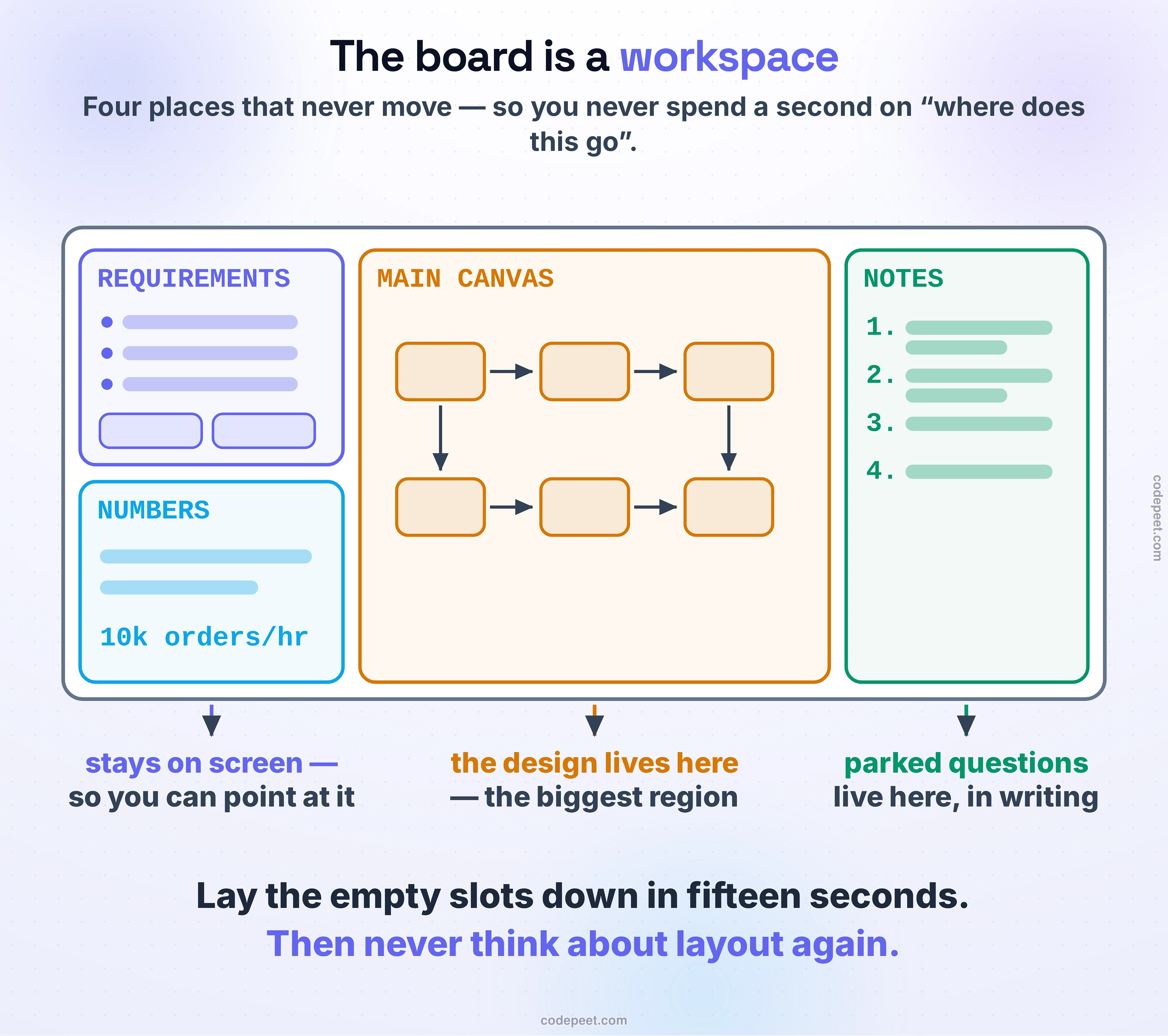
Four regions, and the reason for each:
The requirements corner never moves. The advice from the whiteboarding guides is literally to "keep this visible in one of the corners" for the whole session. This is what makes the previous lesson's advice actually work: Requirements & NFRs That Matter told you to commit to a scope and then point back at it when challenged. You can only point at something that's still on screen.
A numbers strip — the one or two estimates that changed a decision, formula visible. Not a page of arithmetic. The numbers you'll cite when justifying a component.
The main canvas gets the most space, because the end-to-end design is what the interview is about.
A notes column, appended as you go — "dedicate a corner of the board for your notes, and add sequentially." Trade-offs you made, questions you parked, things you owe. This is where park it physically lives; a parked question that isn't written down is a forgotten question.
And leave white space. It isn't wasted room — it's the difference between a board someone can follow and one they can't. The stakes are blunt: if the interviewer is struggling to comprehend your whiteboard, your design experience is lost in translation. You are not being graded on the drawing. You are being graded on the thinking — and an unreadable board hides the thinking.
(How the boxes themselves should look — arrow discipline, labelling, the before-and-after of a messy diagram — is its own craft, and gets its own lesson in Whiteboard & Diagram Craft.)
Each artifact is derived from the last
Now what actually goes in the slots. And here's the part that makes this a method instead of a checklist: you never invent an artifact. You derive it from the one above it.
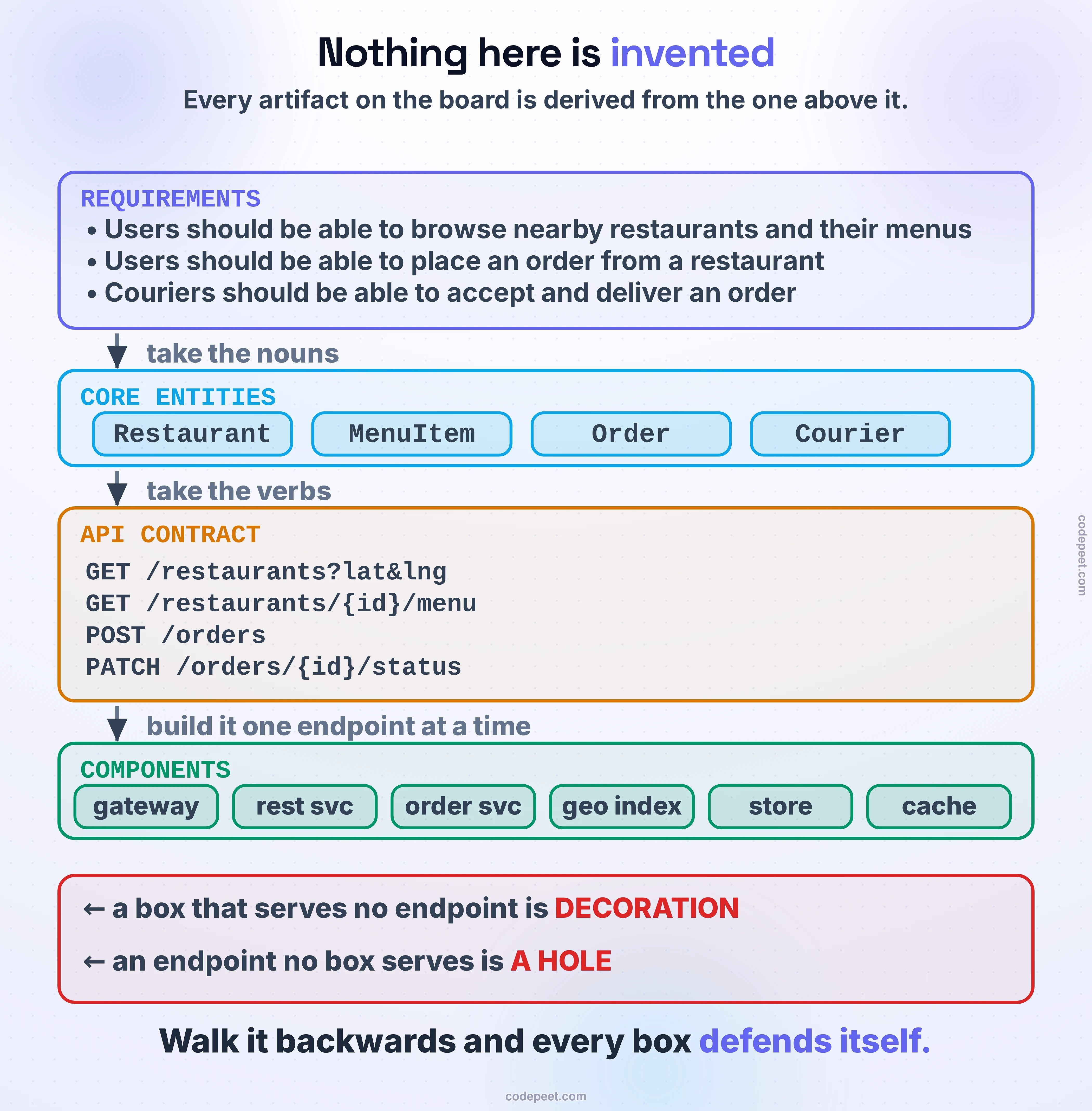
Requirements → entities: take the nouns. Core entities are "the nouns in the requirements" — and that heuristic is almost embarrassingly effective. "Users should be able to browse nearby restaurants and their menus" gives you Restaurant and MenuItem. They're your domain objects and usually your tables. Two minutes, no more.
Watch the words that look like nouns and aren't. Nearby is an adjective — it becomes a query parameter, not a table. Delivery is the verb deliver wearing a disguise — it's a state on an Order, not an entity of its own. Getting this wrong quietly poisons everything downstream, because you'll build storage for a thing that isn't a thing.
Entities → API: take the verbs. The API is the contract between your system and its users, and the guidance is explicit that you "use this contract to guide your high-level design." Plural resource nouns, REST unless you have a reason:
GET   /restaurants?lat={lat}&lng={lng}   # browse nearby
GET   /restaurants/{id}/menu             # nested: a menu lives inside a restaurant
POST  /orders                            # "place an order"
GET   /orders/{id}
PATCH /orders/{id}/status                # courier accepts, then delivers
Notice nearby reappearing as a query parameter — exactly where an adjective belongs. That's the derivation doing its job.
Five minutes, hard cap. Most candidates over-invest here, polishing status codes and pagination while the clock runs. You're demonstrating that you can design a reasonable interface and move on, not shipping documentation.
API → components: build one endpoint at a time. This is the step that changes how the design comes out. Instead of drawing the architecture you remember, you walk your own endpoints and ask what does this request actually need to touch? GET /restaurants?lat&lng needs something that can answer a geospatial query — so a geo index appears, because an endpoint demanded it, not because geo indexes are impressive.
The test that falls out of it
Once every artifact descends from the one above, you get something genuinely valuable for free: you can audit your own board in both directions.
Forward — is anything unserved? Walk each endpoint and ask which box handles it. An endpoint with nothing behind it is a hole: you promised the user something your architecture can't deliver. Interviewers find these instantly, because they read your API and then look at your diagram.
Backward — is anything unearned? Walk each box and ask which endpoint it serves. A component that serves nothing is decoration. And decoration is not a neutral mistake — it's the single loudest memorization tell there is. The most common sign of a recalled answer, per interviewers, is introducing massive complexity right at the beginning — distributed machinery appearing before anything in the problem requires it.
A box that serves no endpoint is decoration. An endpoint no box serves is a hole.
This is also your defence when challenged. "Why the geo index?" isn't answered with "for location queries" — it's answered with "because GET /restaurants takes a latitude and longitude, which came from requirement one." You just walked the chain backwards in one sentence, and that is what a defensible design sounds like.
Fill a board yourself
This is the kind of thing that stays abstract until you do it once. Below is a real board for a food-delivery marketplace — the same system you'll design end to end much later in this part of the course.
Work the chain: pull the entities out of the requirements, build the API from your entities, then place components. Two things to watch. When you pick an endpoint acting on a noun you never named, it gets flagged live — you cannot serve a thing you never declared exists. And each component tells you how many of your endpoints it serves; three of them will always say zero.
Then run it a second time and deliberately add those three. They're the most impressive-sounding boxes in the pool. Watch what the board says about you.
How much data model is enough
This one causes real anxiety, so let's settle it: far less than you think.
You are not in a data modelling interview. You're "not expected to normalize everything or produce a complete schema diagram." Nobody wants third normal form. Nobody wants a full entity-relationship diagram.
The data model shows up twice, and it's small both times. Once as your entity list — the nouns, which you already have. Then again as a few fields sketched next to the database box when you're doing the high-level design, and only for the tables where the shape actually matters.
The bar is one sentence: does the schema support the APIs you already wrote? If GET /restaurants?lat&lng exists, your restaurant table had better have coordinates and something to index them by. That's the whole test.
One cheap upgrade worth knowing: naming an index or two is the highest-value-per-second thing you can write down. "I'd index orders on (courier_id, status) because that's the courier's active-orders query" takes four seconds, ties directly back to an endpoint, and reads as someone who has actually run a database in production. Almost nobody does it.
The setup nobody mentions
A few practical things that are oddly hard to find written down anywhere, and that cost nothing to know.
Know your tool before the day. Real interviews run on Excalidraw, Whimsical, Miro, Zoom Whiteboard or Google Drawings. Fumbling with an unfamiliar canvas in the first five minutes is an entirely avoidable way to look flustered. Ask which one they use, and spend twenty minutes in it beforehand.
You're allowed to prepare a shape library. This surprises people. Excalidraw stores libraries locally in your browser, so you can import a set of shapes — server, database, queue, cache — before the interview and have them ready. This is not cheating, and interviewers say as much: they don't care what plugins you use as long as you aren't wasting time on things that don't matter. You're buying back minutes to spend on the deep dive.
You don't need a beautiful diagram. What you need is "a canvas that keeps up while you think aloud." Boxes, arrows, labels. Legible beats elegant, every single time.
Lay the empty slots down first. Before you draw anything, drop your region labels — requirements, numbers, main canvas, notes — in about fifteen seconds. Now the structure exists and you never have to think about where does this go again. That fifteen seconds is the cheapest attention you will ever buy back.
When to bend it
A scaffold that can't flex is just a slower script. Some slots shrink or vanish depending on who's asking.
At staff level, the tedious arithmetic mostly disappears — the numbers strip collapses to the single estimate that changes a decision. What expands instead is the identification of the core difficulty. Nobody senior is impressed by careful multiplication.
At a startup, they usually want something deployable on their actual stack, this quarter. Theoretical elegance loses to what would you actually build on Monday.
On an infrastructure question — design a rate limiter, design a message queue — the entity and API slots collapse to almost nothing, and the mechanism slot swallows the interview. Don't force a REST contract onto a problem that doesn't have users.
The move that makes skipping a slot a strength rather than an omission is to skip it out loud: "I'll keep the API light here since this is an internal component, and spend the time on the eviction mechanism instead — that's where the interesting part is." Now you haven't forgotten the slot. You've made a judgment about it, in the open, which is exactly the thing being measured.
What the template actually buys
Same honest framing as The Delivery Framework: the template is not the thing being graded. Nobody gets an offer for having tidy regions.
What it buys is attention. The board holds the state so your head doesn't have to. The requirements are on screen, so you're not trying to remember what you agreed to. The notes column is holding your parked questions, so you're not trying to remember those either. You never spend a second on where does this go, because that was decided before the interview started. Every one of those is working memory handed back to you — and working memory is what you think with.
And the derivation chain buys something else: a board you can defend line by line. Every box traces back through an endpoint, to an entity, to a requirement the interviewer agreed to. When they push — and they will — you're never reaching for a justification. You're just walking backwards along a path you already laid.
So: fixed slots, derived contents. Regions that don't move. Nouns, then verbs, then boxes. And the test you can run on your own board at any moment — does everything here trace back to something we agreed on?
You now have the clock and the board. What you don't have is the voice — because all of this happens out loud, and a design nobody can follow scores like a design that isn't there. That's next, in Communicating While Designing.