Look at Your Data (The #1 Rule)
Introduction
You've spent three sections building a measurement stack — metrics, judges, calibration, spot checks. Now the section that makes all of it point at the right thing. It opens with the single most important, most ignored rule in applied AI, the one every practitioner who ships reliable systems repeats like a mantra:
Look at your data.
That's it. Read your traces — the actual conversations your system had with real users — one at a time, with your own eyes. It sounds too simple to be the headline, which is exactly why most teams skip it: they jump straight to dashboards and LLM judges and “what's our score?” This is error analysis, and “letting failure modes emerge from your own data is the single highest-ROI activity in AI development.” It's the step that separates teams shipping reliable AI from teams firefighting forever — and over the next lessons it becomes a whole flywheel. But it starts here, with looking.
The Rule, and the Universal Mistake
Here's the pattern, repeated at thousands of companies. The team ships an AI feature, it feels a bit off, and they reach for infrastructure: a metrics dashboard, an eval harness, an LLM judge with a dozen criteria. Months later they have beautiful charts and still don't know why the product is bad.
The mistake is building the measurement before looking at the thing being measured. As the field's most-cited eval practitioners (Hamel Husain, Shreya Shankar) put it: start with error analysis, not infrastructure. You cannot write a useful judge for failures you haven't seen, and you cannot see them in an aggregate. The order is inverted from intuition: you read first, and the evals come out of the reading. Crafting elaborate criteria before looking is how teams end up measuring low-probability defects that don't matter while the real failure modes sail through unmeasured. This is the cardinal sin from L159 (Eval Anti-Patterns (Vibes-Based Testing)) stated as a positive law: a number changed, and nobody read the traces behind it. Don't be that team. Read the traces.
What “Your Data” Is: Traces
“Look at your data” is specific. For an AI product, your data is your traces — and a trace is the full record of one interaction, not just the final answer:
- the user's turns (every message, in a multi-turn conversation),
- the assistant's responses at each step,
- the tool calls it made and what they returned,
- the retrieved documents (the RAG context it was actually given),
- and the system prompt that framed the whole thing.
Why the whole trace? Because failures hide in the gap between steps. An answer can look wrong on the surface when the real problem was three steps back — a tool that returned garbage, a retrieval that fetched the wrong document, an early misread of the user's intent. You cannot debug what you cannot see, and a bare input → output pair hides exactly the causal chain you need. This is the Gulf of Comprehension from L156 (Why Evaluating LLMs Is Uniquely Hard) made literal: you can't understand a system whose behavior you've never actually watched.
Why a Green Dashboard Lies
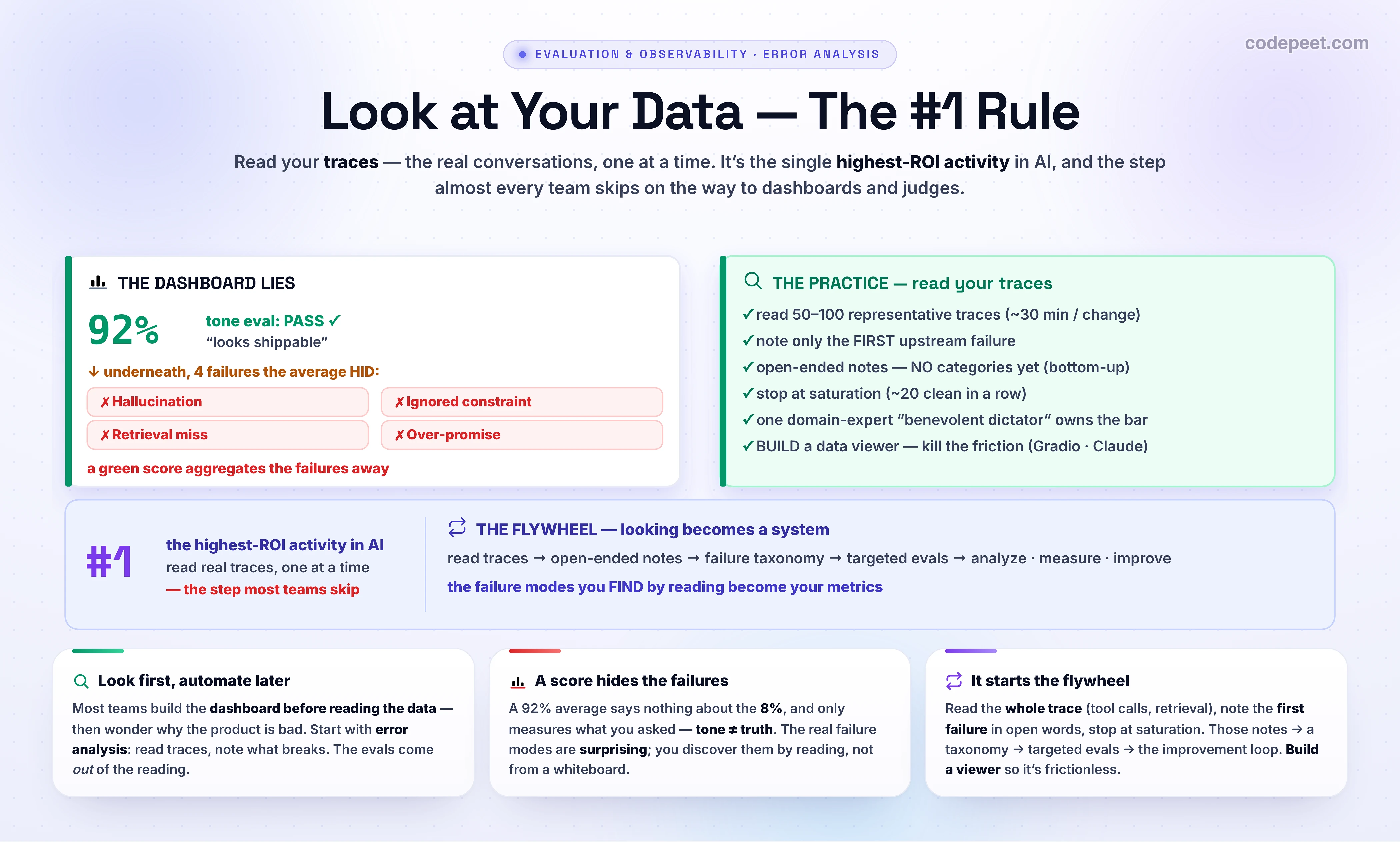
“But our eval says 92% — why read traces?” Because a score is an average, and the average aggregates the failures away. The 92% tells you nothing about the 8%, and the 8% is where your product is dying. Worse, the metric only measures what you told it to: a tone-classifier that scores 92% is reporting that the tone is polite — it says nothing about whether the answer was true, complete, or safe. Polite, confident, and completely wrong scores green.
And you can't shortcut the looking by guessing the failure modes, because the real ones are surprising — “models that crush mathematical reasoning sometimes fail basic legal analysis, with correlations that aren't what we expected.” No one predicted your system's specific bugs from a whiteboard; they were discovered by reading outputs. Which is the deepest point of the whole section: the ways your system breaks become your metrics. You don't write the evals and then find failures — you find the failures by looking, and those become the evals. Error analysis is what tells you which evals are even worth writing.
See It: Read the Traces
Don't take it on faith — feel it. Below, a tone-classifier eval reports 92% PASS and looks shippable. Now do the thing the dashboard can't: read the 10 actual traces. Judge each one fine or broken, and when it's broken, name the first thing that went wrong. Watch what the green number was hiding.
Four of those ten were broken — a hallucinated policy, a dropped constraint, an ignored retrieval, an over-promise — and every one had a perfectly polite tone, so the tone metric waved them all through at 92%. You can't write a “don't contradict the retrieved policy” eval until you've seen the model contradict the retrieved policy. That's the move: the four failure modes you just surfaced by reading are precisely the four evals worth building next. The dashboard told you the score; the traces told you the truth.
How to Look: The Practice
Error analysis is a practice, not a vibe — here's the actual procedure:
- Read 50–100 representative traces. Not cherry-picked, not all happy-path — a real sample of production. Budget ~30 minutes every time you make a significant change.
- Note only the first failure. Pipelines are causal: one early error (a misread intent, a bad retrieval) cascades into a mess of downstream symptoms. Annotate the first upstream thing that went wrong — fixing it often dissolves the whole chain, and it stops you drowning in symptoms.
- Write open-ended notes — no categories yet. Free text, in your own words: “invented a refund window,” “ignored the date constraint.” Resist the urge to pre-build a checklist; let the failures define themselves, bottom-up. (Top-down categories blind you to the failures you didn't anticipate.)
- Stop at saturation. When ~20 traces in a row turn up nothing new, you've likely seen the main failure modes — that's theoretical saturation, your signal to stop.
In code, this is barely code at all — the point is that a human reads every trace; the function just enforces the discipline:
import random
# The #1 rule isn't a library — it's YOU reading traces. This only removes friction and
# enforces the discipline: a representative sample, the FIRST failure, open-ended notes.
def error_analysis(traces, n=100):
    sample = random.sample(traces, min(n, len(traces)))     # representative, not cherry-picked
    notes, clean_streak = [], 0
    for t in sample:
        show(t)           # render the WHOLE trace: user turns, tool calls, retrieved docs, sys prompt
        first = input("first thing that went wrong (blank = looks fine): ").strip()
        if first:
            notes.append({"id": t["id"], "note": first})    # FREE TEXT — NO predefined categories yet
            clean_streak = 0
        else:
            clean_streak += 1
        if clean_streak >= 20:        # theoretical saturation: ~20 clean in a row -> you can stop
            break
    return notes          # -> next lesson: group these into a failure taxonomy (open coding)
Notice what's not here: no LLM grading, no score. This step is you, reading, writing what you see. The automation comes later (judges, dashboards) — and it'll be good automation precisely because it was built from what you found here.
Who Looks — and Build a Data Viewer
Two practical multipliers decide whether you actually do this or just intend to.
One domain expert owns the quality bar. Pick a single person who deeply understands your users — a “benevolent dictator” / principal annotator — to be the quality decision-maker. Evaluation is subjective sensemaking (recall criteria drift from L168 (Writing Judge Prompts & Rubrics)); design-by-committee produces mush. One opinionated expert, reading, produces a coherent bar.
Build your own data viewer. This is described as “the single most impactful investment you can make for your AI evaluation workflow.” A generic tool won't fit your trace's shape; a 30-line custom viewer removes the friction that quietly stops you from looking — and the easier it is to look, the more you'll look:
# "The single most impactful investment in your eval workflow" is your OWN data viewer.
# Generic tools don't fit your trace shape; ~30 lines removes the friction that stops you
# from looking. (Have Claude generate one from a sample trace — Gradio / Streamlit / FastHTML.)
import streamlit as st
def viewer(traces):
    t = traces[st.number_input("trace #", 0, len(traces) - 1, 0)]
    st.json(t)                                   # the full trace: turns, tool calls, retrieved docs
    note = st.text_area("first failure, in your own words")
    if st.button("save"): save_note(t["id"], note)

# Use Claude as an ASSISTANT (never a replacement) to PROPOSE clusters of the notes you wrote:
from anthropic import Anthropic
def suggest_modes(notes):
    msg = Anthropic().messages.create(
        model="claude-opus-4-8", max_tokens=1024,
        messages=[{"role": "user", "content":
            "Group these error-analysis notes into 5-10 candidate failure modes; "
            "I will rename and merge them.\n\n" + "\n".join(notes)}])
    return msg.content[-1].text      # a STARTING point — you read the traces, you own the taxonomy
That's the whole secret to why frontier labs are good at this: Anthropic invests in tooling for viewing eval transcripts and regularly reads them. The viewer also makes a good place to use an LLM — not to replace your reading, but to cluster the notes you already wrote into candidate failure modes you then rename and refine. You read; Claude tidies.
From Notes to the Flywheel
What do you walk away with? Not a score — a prioritized list of decisions, tied to your actual data: what to change today, what to measure going forward, and what to keep watching. Those open-ended notes are the raw material for the rest of this section, which turns looking into a system:
- Group the notes into a failure taxonomy — 5–10 named, counted failure modes (L172 (Open Coding & Failure Taxonomies)).
- Turn the biggest modes into targeted evals — now you know exactly which judges and checks are worth building (L173 (From Failures to Targeted Evals)).
- Run the loop — analyze (look) → measure (eval the top mode) → improve → look again (L174 (The Analyze → Measure → Improve Loop)).
This is the flywheel: looking feeds the taxonomy, the taxonomy feeds the evals, the evals catch regressions, and you keep looking to find what the evals don't yet cover. And it's how human spot-checks (L170 (Human-in-the-Loop Spot Checks)) get their teeth — every flagged trace is an entry in tomorrow's analysis. The whole edifice of evaluation rests on this unglamorous foundation: a person, reading the data, one trace at a time.
🧪 Try It Yourself
Do the highest-ROI hour in your AI project — today:
- Pull 30 real traces. From production if you have it, from a quick test run if you don't. Get the whole trace (input, output, any tool/retrieval steps), not just the final answer.
- Read them — all of them — and write one line each. Open a doc or a spreadsheet. For each trace, jot the first thing that went wrong, in your own words. Blank if it's fine. No categories yet.
- Resist the dashboard. Don't compute a score. Don't write a judge. Just read and note. (It'll feel unproductive. It's the most productive thing you'll do all week.)
- Skim your notes. You'll see 4–6 themes repeating — those are your failure modes. Pick the most frequent one. That's the eval to write next (next lesson) and probably the bug to fix first.
If you've never done this, brace for the surprise: the failures you find will not be the ones you expected — and that gap, between what you assumed and what's actually breaking, is the entire reason this rule is #1.
Mental-Model Corrections
- “Looking at data is unproductive — I should build evals/dashboards.” Inverted. Looking is the highest-ROI activity, and it tells you which evals are even worth building. Infrastructure first is how teams measure the wrong things for months.
- “My 92% score means it's good.” A score is an average that hides the failures, and it only measures what you asked (tone ≠ truth). The 8% is where the product is failing.
- “I can list the failure modes from my desk.” You can't — the real ones are surprising and only appear in the traces. The failures you find become your metrics.
- “Just look at the input and output.” Read the whole trace — tool calls, retrieval, system prompt. Failures hide between the steps; the answer is often a symptom of an upstream cause.
- “Catalog every problem in each trace.” Note the first upstream failure only — pipelines cascade; fixing the first often fixes the chain, and you avoid drowning in symptoms.
- “Pre-define the failure categories.” Use open-ended notes and let categories emerge (bottom-up). A top-down checklist blinds you to the failures you didn't anticipate.
- “Reviewing by committee is more rigorous.” Use one domain-expert decision-maker — a coherent bar beats averaged opinions — and build a data viewer so looking is frictionless.
Key Takeaways
- Look at your data — read your traces. It's the #1 rule and the single highest-ROI activity in AI, and the step most teams skip on their way to dashboards and judges.
- A trace is the whole record (turns, tool calls, retrieval, system prompt), not just input→output — because failures hide between the steps.
- A green dashboard lies: a score aggregates failures away and measures only what you asked (tone ≠ truth). The failure modes are surprising — you discover them by reading, and they become your metrics.
- The practice: 50–100 representative traces (~30 min/change), note only the first upstream failure, open-ended notes (no categories — bottom-up), stop at saturation (~20 clean).
- Multipliers: one domain-expert “benevolent dictator” owns the bar, and build your own data viewer (the single most impactful investment) to kill the friction — like the frontier labs that read their transcripts.
- It starts the flywheel: notes → taxonomy (L172 (Open Coding & Failure Taxonomies)) → targeted evals (L173 (From Failures to Targeted Evals)) → the analyze→measure→improve loop (L174 (The Analyze → Measure → Improve Loop)). Everything else in evaluation rests on a person reading the data.