Distributed Tracing
A List Has No Shape
The last three lessons built something specific. Records that are structured, so a machine can query them. A shared identifier, so every record from one request can be pulled together. And numbers that tell you something is wrong cheaply enough to alert on.
Put those together and pull up one slow request. You get this:
14:32:07.412  gateway    request received
14:32:07.418  orders     validating
14:32:07.441  inventory  checking stock
14:32:07.802  payments   authorising
14:32:08.913  orders     writing row
14:32:09.004  gateway    responding  502
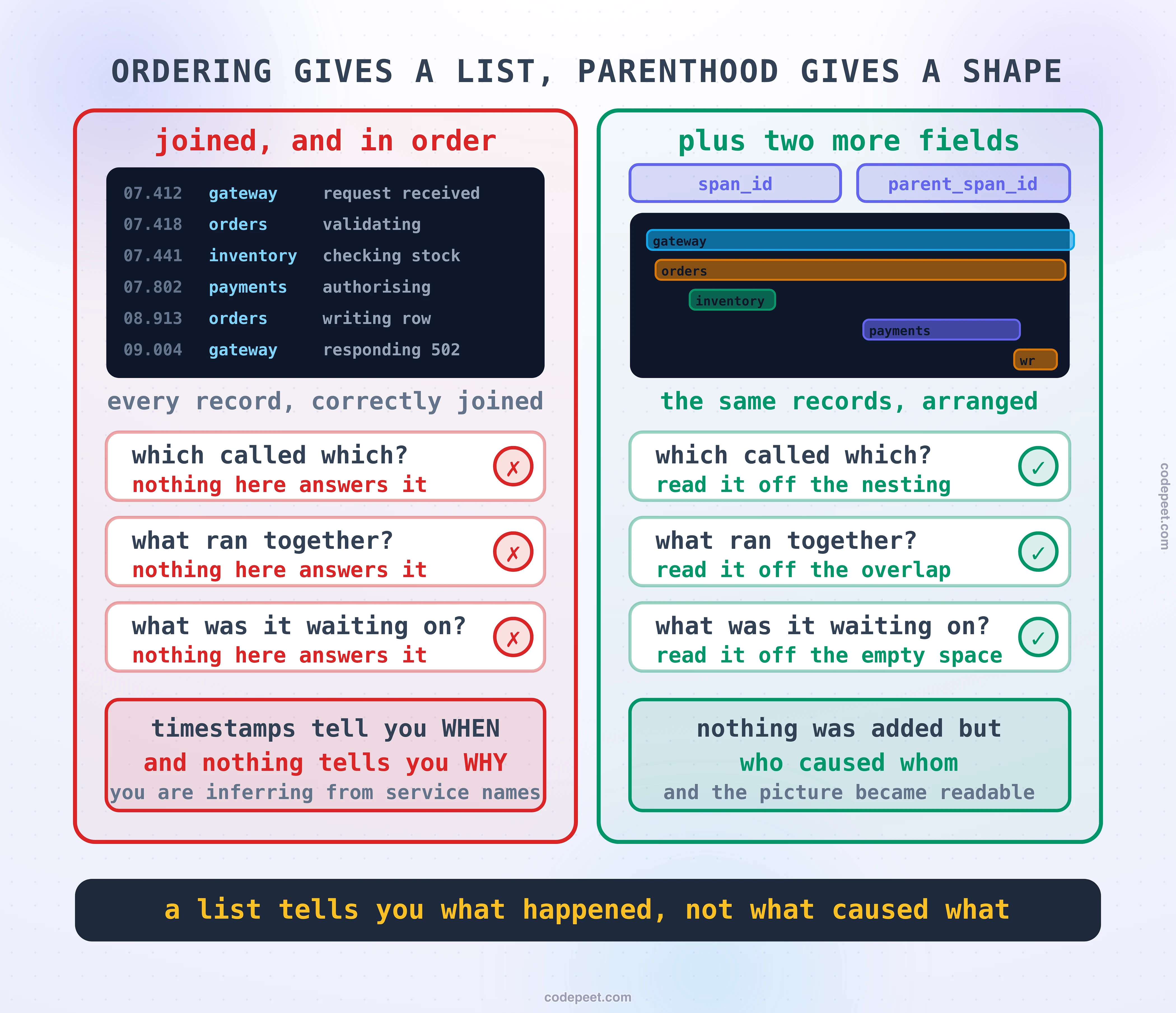
Correct, complete, in order, and it still will not tell you what you need. Three questions, and none of them are answerable from that list.
Which of these called which? Did orders call inventory, or did the gateway call both? The list has no idea. You are inferring it from service names and from what you happen to remember about the architecture.
Which of these ran at the same time? Timestamps tell you when things started. They do not tell you whether inventory and payments were running concurrently or one after the other, and that difference decides whether the request took the sum of them or the maximum of them.
What was the request actually waiting on? There is a gap of nearly four hundred milliseconds between inventory starting and payments starting. Was something slow? Was something queued? Was orders doing work of its own? The list is silent, and that gap is the largest single thing in the request.
Ordering is not structure. A list tells you what happened. It cannot tell you what caused what, what overlapped, or what was being waited on, and those three things are most of what an investigation is.
This lesson is the field that fixes it, and then the much less obvious matter of how to read the result, which turns out to be a genuine skill with rules that are worth learning before your first real incident rather than during it.
Three Fields, and the List Becomes a Tree
The vocabulary comes from a paper Google published in 2010 describing Dapper, their internal tracing system, and the words it introduced are still the words everybody uses. The unit of work is a span. A whole request is a trace. And a trace is a tree of spans.
A span is a small record. What matters is which of its fields do which job.
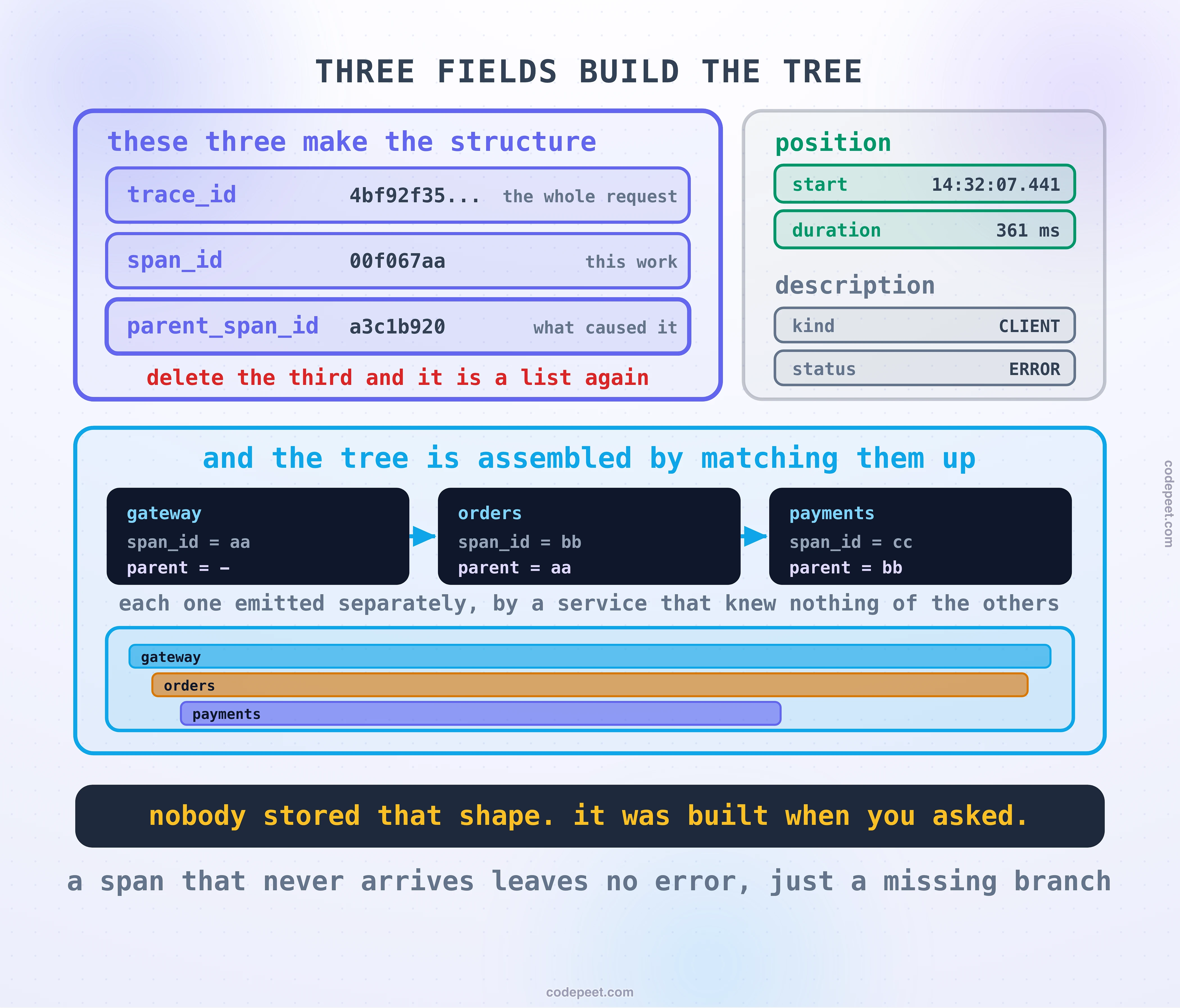
Three fields build the structure:
trace_id, shared by every span in the request. This is the identifier the last lesson but one was entirely about.span_id, belonging to this one piece of work.parent_span_id, thespan_idof whatever caused this piece of work to happen.
That third field is the whole trick, and it is worth pausing on because it is easy to read past. Delete parent_span_id and everything collapses back into the list from the previous section. You would still have every record, still perfectly joined by trace_id, still in order, and you would once again have no idea what called what. One field is the difference between a list and a shape.
Two fields give it position: when it started, and how long it took. Together with the structure fields, that is enough to draw the picture.
The rest is description: what kind of operation it was, whether it succeeded, and any attributes attached to it.
One reassurance before the reading skill, because that list makes this look like a lot of typing. You will write very few of these by hand. That was Dapper's other insight and it is why the technique spread at all: instrument the handful of libraries every service already uses, the ones handling incoming requests, outgoing calls, database drivers and queues, and the spans appear on their own. A request through an ordinary service produces a usable trace with no application code written for it, and the spans you add yourself are the few describing work that only you know is interesting.
Here is the thing worth understanding about how the picture gets made, because it explains several of this lesson's rough edges. Nobody stores the tree. Each service emits its own flat spans, independently, with no knowledge of the others. The tree is assembled at the moment somebody asks for it, by taking every span with the same trace_id and matching each one's parent_span_id against another one's span_id.
Which has a consequence you will meet in practice: if a span never arrives, nothing errors. The tree is simply assembled without it, and what you see is a picture that looks complete and is missing a branch. The last section of this lesson is about exactly that.
Drawn on a timeline, with nesting for parenthood and horizontal position for time, that assembled tree is what everyone calls a waterfall. Which is where the interesting part starts, because a waterfall is much easier to produce than it is to read.
The Widest Bar Is Always the Root
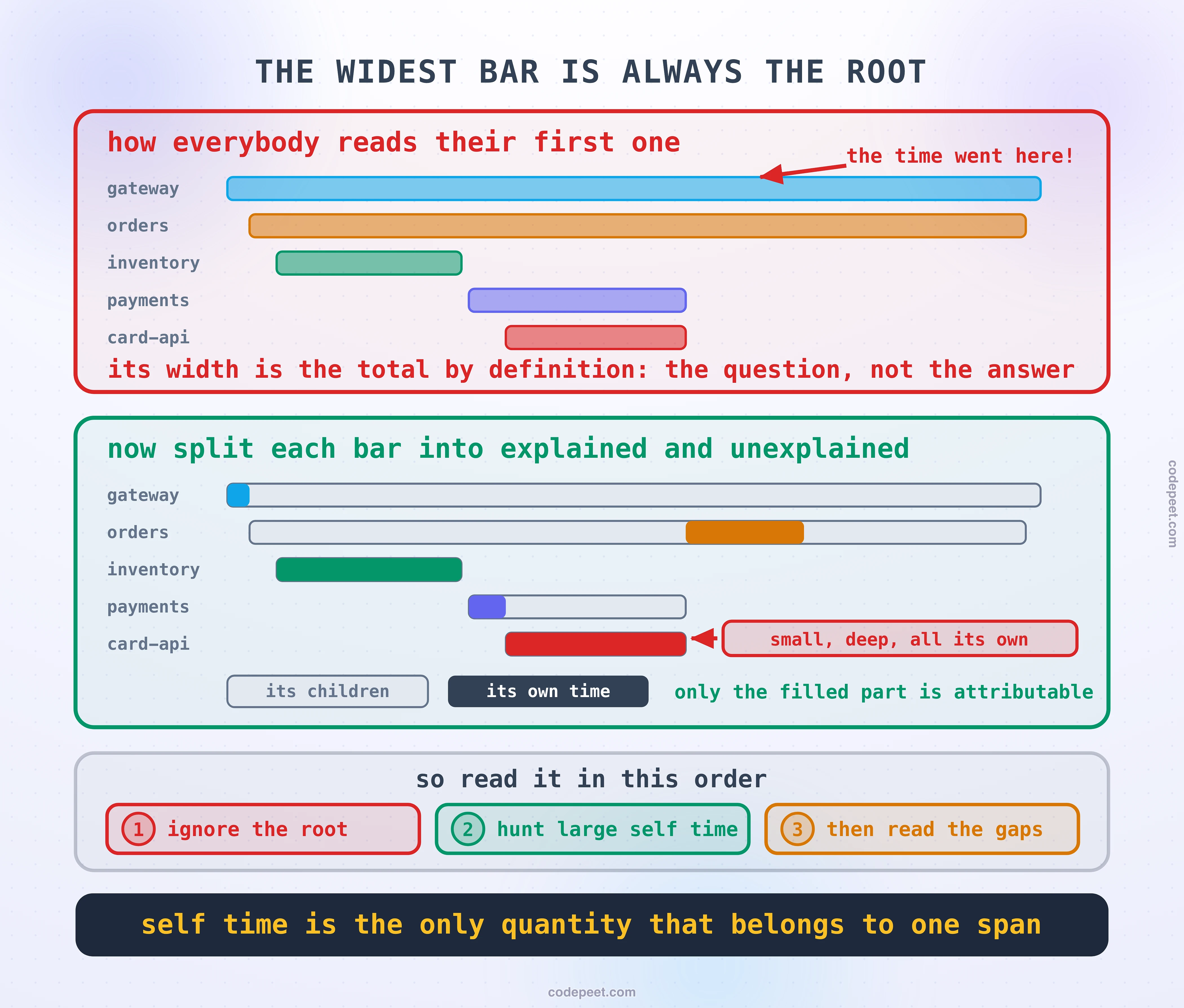
Open your first waterfall during your first incident and there is an overwhelming instinct: find the longest bar, because the longest bar is where the time went.
The longest bar is the root span. It is always the root span.
A span's duration includes every one of its children. The root span started when the request arrived and ended when the response was sent, so its width is the total duration by definition. Pointing at it and saying "the time went there" is restating the question in a slightly larger font. The same is true one level down: a service's span contains everything it called, so a wide bar might be a slow service, or it might be a perfectly fast service that called something slow.
What you actually want is the part of each bar that is not explained by its children. That has a name:
Self time is a span's total duration minus the time covered by its children. It is the work that span did itself.
Self time is where the answer lives, because it is the only quantity that is attributable. Total duration is shared between a span and everything beneath it; self time belongs to one piece of work and to nothing else.
And self time is not only computation. It is serialisation, framework overhead, connection pool waits, garbage collection, and time spent sitting between one call and the next. Which means a span with large self time and no children is not necessarily doing anything. It may be waiting, and the trace cannot see the difference, which is a limitation worth remembering.
So the reading order that actually works is close to the reverse of the instinct:
- Ignore the root. It is the question, not the answer.
- Look for large self time, anywhere in the tree and especially deep in it. A small bar low down that is entirely its own time is a much better lead than a wide bar near the top that is entirely its children.
- Then look at what has no bar at all, which is the next section and is the part most people never learn.
Read the Gaps, Not the Bars
Here is the reversal that separates somebody who has read about tracing from somebody who has used one in anger.
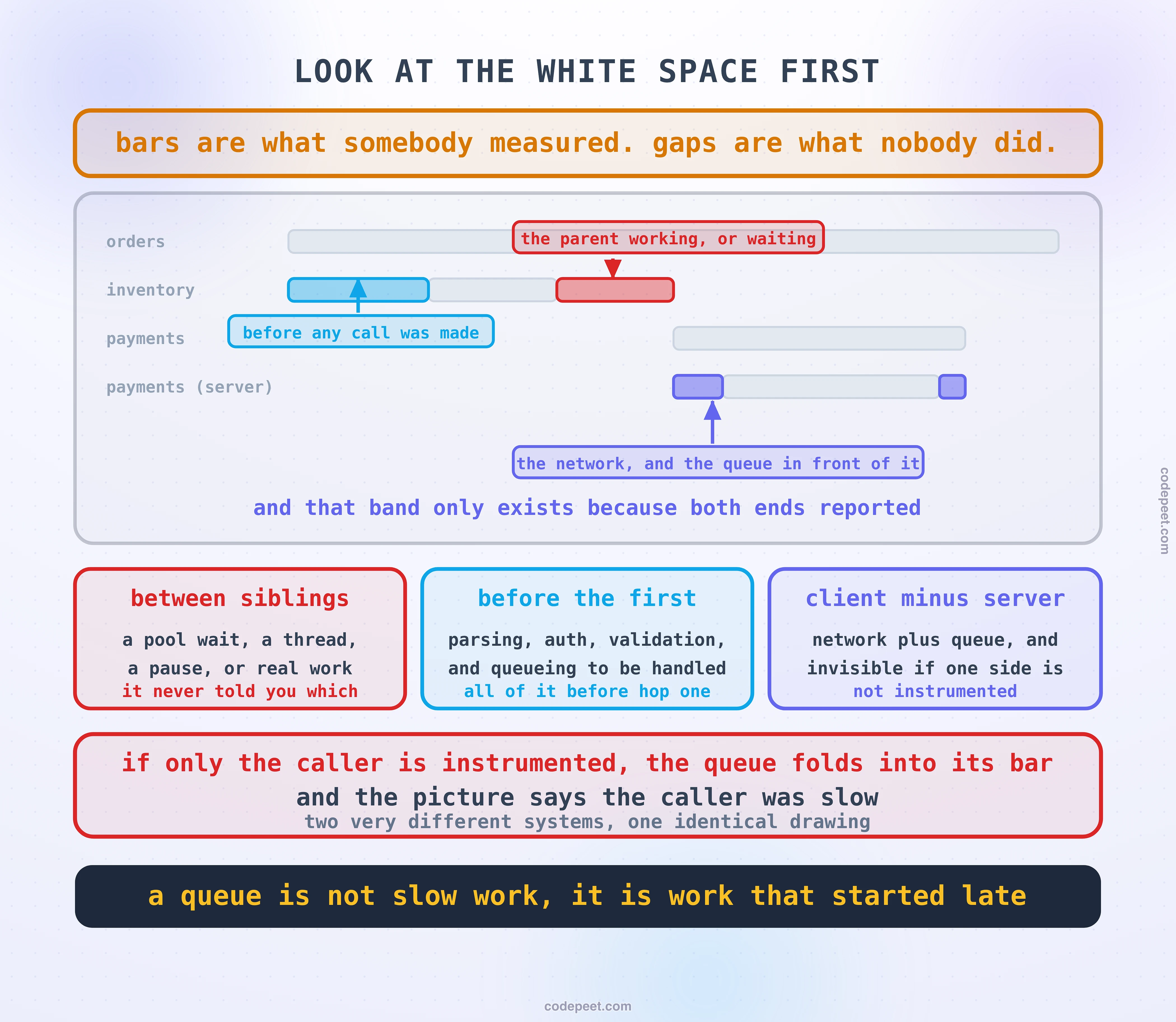
The bars are the part of the request that somebody thought to measure. The gaps are the part nobody did. That is exactly why the gaps are more interesting.
A waterfall makes emptiness visible, and there are three kinds of it, each meaning something different.
A gap between two sibling calls. The parent finished one call at 14:32:07.441 and started the next at 14:32:07.802. For those three hundred and sixty milliseconds it was doing something, and it never told you what. In practice it is nearly always one of a short list: waiting for a connection from a pool, waiting for a thread, a garbage collection pause, or genuine computation that nobody instrumented because it did not feel like it needed a span.
A gap before the first child. Everything that happened between the request arriving and the first downstream call being made: parsing, authentication, validation, and any queueing in front of the handler.
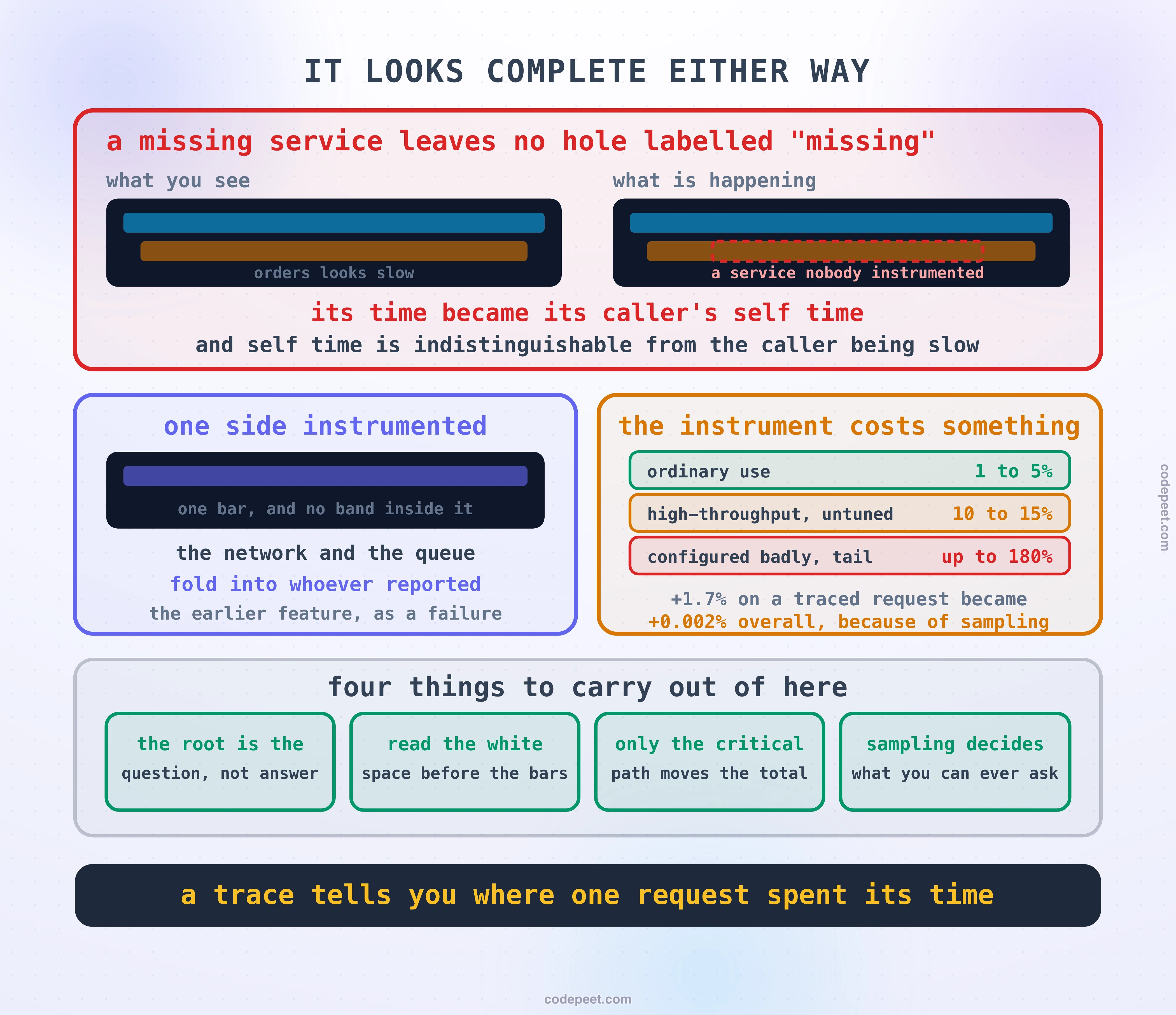
The gap between the two sides of one call. This is the one worth knowing about, because it is invisible unless you have set things up correctly. When one service calls another, there are normally two spans for that single call: the client span, recorded by the caller, and the server span, recorded by the service that received it. The client span is always the longer of the two, and the difference is real:
client span (caller)        |------------------------------|  412ms
  server span (callee)         |------------------------|     380ms
                              ^^                        ^^
                          network + queue           network back
That thirty-two milliseconds is the network, plus however long the request sat in the callee's accept queue before anything picked it up. On a healthy system it is small and boring. When a service is overloaded it is where the latency is, because an overloaded service is one whose queue is long, and a queue does not show up as slow work, it shows up as work that started late.
And here is the sharp edge: that band only exists if both sides are instrumented. If the callee emits nothing, the queueing time is silently folded into the caller's span and the picture tells you the caller was slow. Two very different systems, one identical drawing.
So the habit to build, and it is a habit rather than a technique: when you open a waterfall, look at the white space first. Time that no bar explains is the most valuable thing on the screen, precisely because nobody chose to put it there.
Only the Critical Path Counts
One more property of the shape, and this is the one that decides where a week of engineering time goes.
Two child spans that overlap on the timeline ran at the same time. Two that do not overlap ran one after the other. That sounds like an observation and it is actually the most consequential thing in the picture, because it splits every call in the request into two categories.
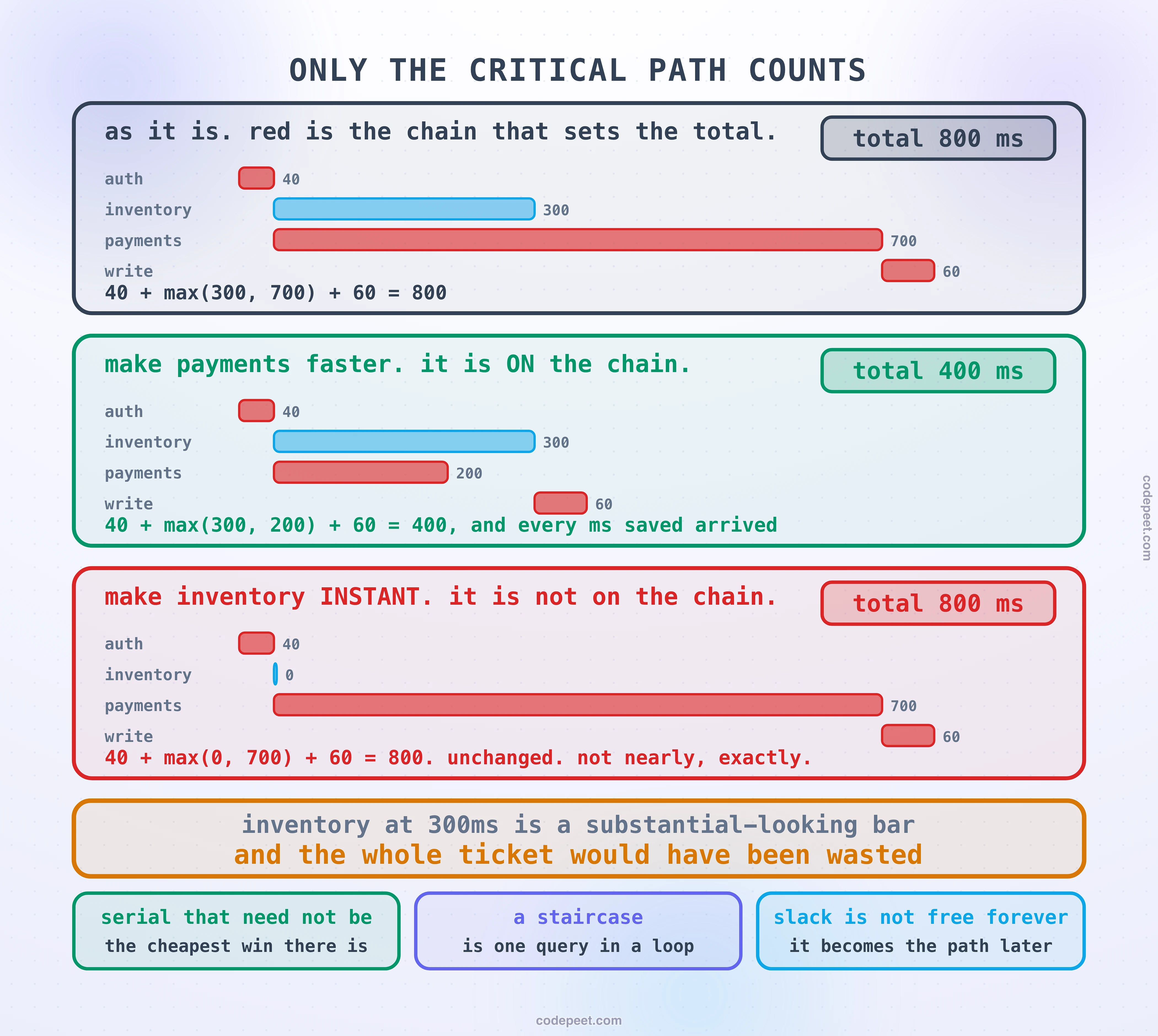
The critical path is the longest chain of calls that had to happen one after another. It is what sets the total, and nothing else does.
Work a small example. A request calls three services:
auth, 40ms, must finish before anything else startsinventory, 300ms, running in parallel with paymentspayments, 700ms, running in parallel with inventorywrite, 60ms, cannot start until both have returned
Total: 40 + max(300, 700) + 60 = 800ms. The critical path is auth, then payments, then write.
Now make inventory instant. Not faster: instant, zero milliseconds, free. The total is 40 + max(0, 700) + 60 = 800ms. Unchanged.
Optimising anything off the critical path changes the total by exactly nothing.
This is not a marginal effect and it is not a rounding error. It is zero. And inventory at three hundred milliseconds is a substantial-looking bar, the kind of thing that gets picked up in a review and turned into a ticket, and the entire ticket would have been wasted.
The uncomfortable part is that the critical path is genuinely difficult to see by eye. Your attention goes to the longest bar, and the longest bar is on the critical path only sometimes. Any decent tracing tool will mark the path for you, and it is worth finding that feature before you need it.
Three things follow from this, and they are worth having as instincts.
Look for serial chains that did not need to be serial. Two calls that do not depend on each other's results but run one after the other are the cheapest win in performance work, because you are not making anything faster, you are just declining to wait.
A staircase is a specific bug. Twenty near-identical spans, each starting as the previous one ends, is one query being run in a loop. It has a name, the N-plus-one, and the waterfall makes it unmistakable, because nothing else in a system produces that shape.
Slack is not free forever. A parallel call with room to spare costs you nothing today and becomes the critical path the moment it degrades. It is not urgent. It is not irrelevant either.
Deciding What to Keep Before You Know What Happened
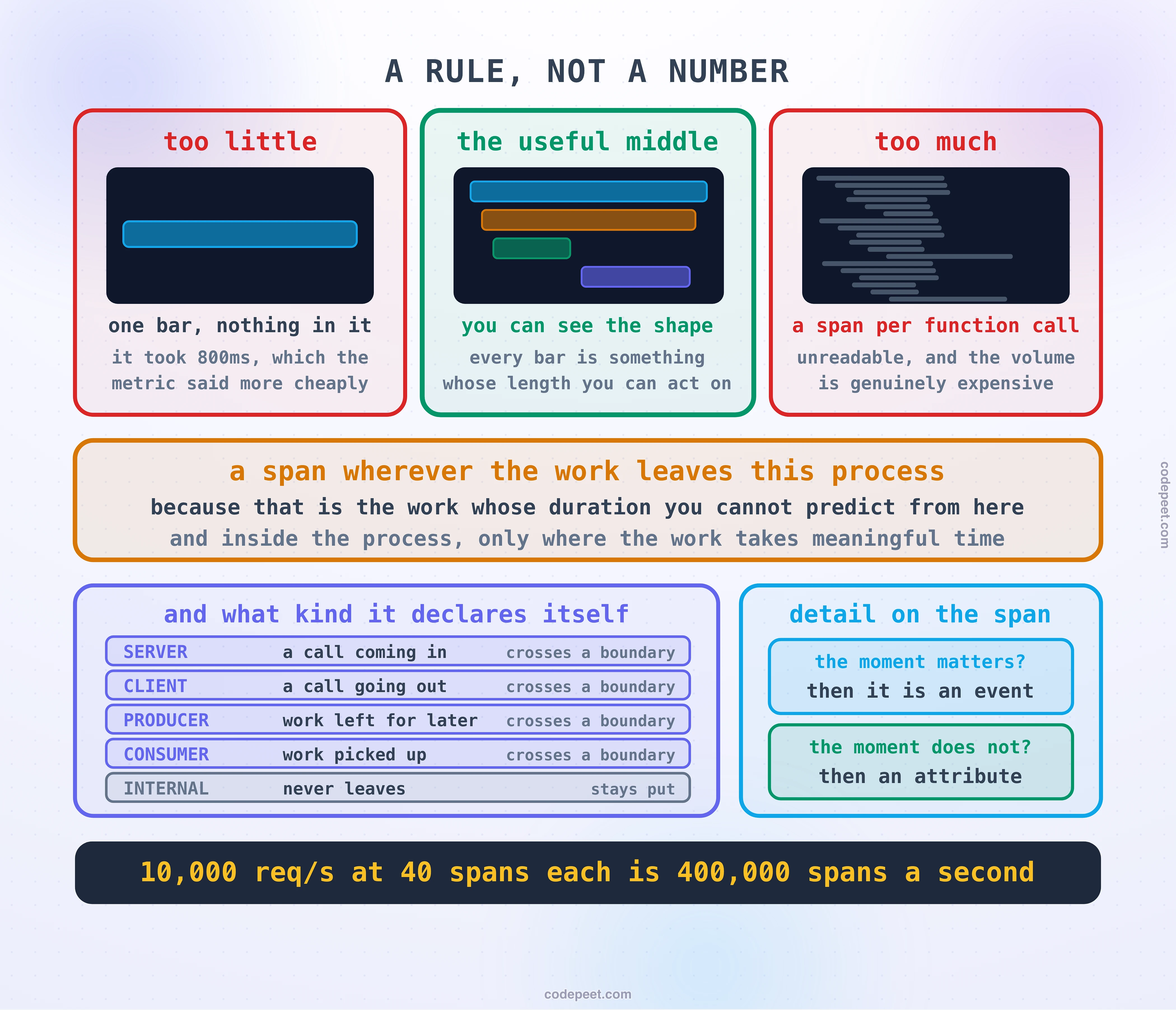
Traces are expensive in a way metrics are not, and the previous lesson explained why: a metric is one number regardless of traffic, while a trace is a set of records per request. A service handling ten thousand requests a second with forty spans in each trace is producing four hundred thousand spans a second. Nobody keeps all of that.
So you sample, and there are exactly two places to make the decision.
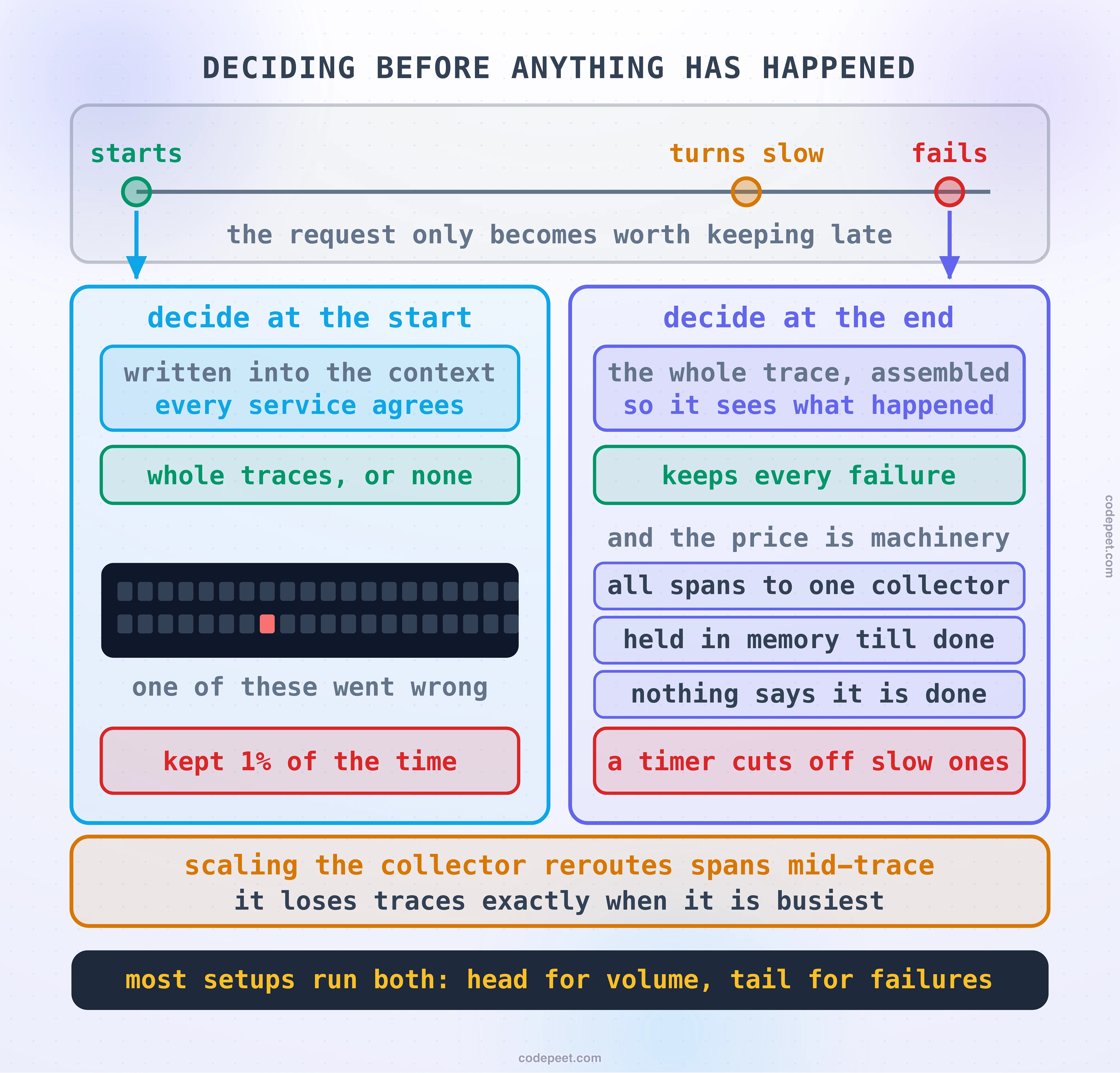
Head-based sampling decides at the start. When the request arrives, before it has done anything, a decision is made and written into the trace context, which then travels with the request. Every service reads the same decision, so the whole trace is kept or the whole trace is dropped. That property matters more than it sounds: you never get half a trace, and half a trace is worse than none, because it looks complete.
It is cheap, it needs no coordination, and it is what most systems run. A typical rate is one percent.
Now say the cost out loud, because it is easy to nod past:
At one percent, the request that went wrong is kept one percent of the time.
The decision was made before anything went wrong, so it cannot possibly have taken that into account. You are asking a system to decide what will be interesting before anything interesting has happened, and ninety-nine times in a hundred, the trace of the incident you are investigating does not exist.
That is also, incidentally, why the flag in the standard header is described as a recommendation from the caller rather than a fact. It is a decision, made early, by somebody else.
Tail-based sampling decides at the end. Collect every span, wait until the whole trace has arrived, look at it, and only then decide. Now you can keep every error, every trace over some latency, and a small representative slice of the ordinary ones. Reported results are strong: layered strategies cutting span volume by around ninety percent while keeping every error trace and every slow trace.
The price is not money, it is machinery, and it has one genuinely awkward corner.
Every span belonging to one trace has to arrive at the same collector, so spans must be routed by trace id rather than balanced freely. Those spans are held in memory until the trace is finished. And there is the corner:
Nothing tells the collector that a trace is finished. It waits for a timeout and then assumes.
Which means a sufficiently slow request can be cut off by the very timeout that exists to catch slow requests. Set the window long and you hold more memory; set it short and you truncate the traces you most wanted. There is no setting that avoids both.
One more sharp edge worth knowing before you build it: scaling the collector reroutes spans mid-trace, so adding capacity during a busy period can produce a burst of incomplete traces. The system is most likely to lose traces at the moment it is under the most load, which by now should sound like a familiar shape.
In practice most serious setups do both: head-based sampling to hold the volume down, with tail-based on top to make sure the failures survive.
Why a Trace Can Never Tell You a Rate
This section is short and it prevents a mistake that is made constantly, including in incident reviews where it changes the conclusion.
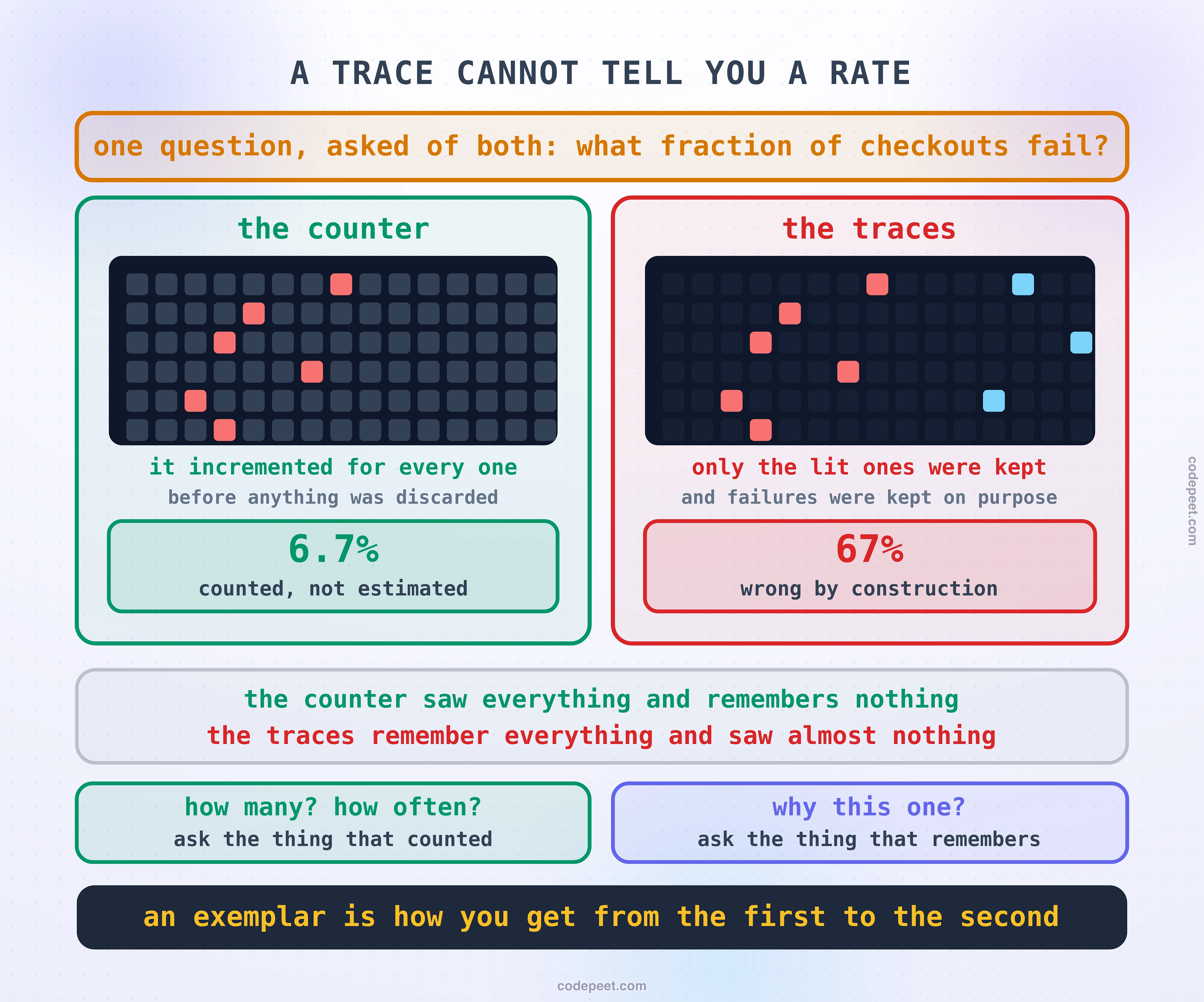
You are sampling at one percent. Someone asks what proportion of checkouts are failing. You search your traces, find nine hundred checkouts of which twenty-seven failed, and report three percent.
That number is not an estimate. It is not a measurement with error bars. It is an artefact of your sampling configuration.
If any part of your sampling is biased toward errors, and tail-based sampling is deliberately biased toward errors, then failures are over-represented in what you kept by exactly the amount you configured. You have computed a percentage of a population you designed to be unrepresentative.
So hold the two signals apart, and the distinction is clean:
A metric counted every request before anything was discarded. A trace kept a few requests and remembers everything about them. "How many" is a question for the thing that counted. "Why this one" is a question for the thing that remembers.
Which is the same division the section opened with, now with a reason attached rather than an assertion. It also settles a recurring argument. When somebody proposes replacing metrics with tracing because traces contain more information, the answer is not that metrics are cheaper, although they are. It is that a sampled signal cannot produce a rate, and rates are what you alert on.
The two do join up, and the join is worth using. A metric sample can carry the trace id of one request that contributed to it, which the map lesson introduced under the name exemplar. That gives you the honest version of the workflow: the count comes from the metric, and the example comes from the trace, and clicking from one to the other is a click rather than an investigation.
How Much to Instrument
A practical question with two bad answers at either end, and the failure at the enthusiastic end is more common than you would expect.
Too little is a single span covering the whole request. It tells you something took eight hundred milliseconds, which the metric already told you more cheaply.
Too much is a span per function call. This is a real failure mode with two costs. The picture becomes unreadable, because a tree with four hundred nodes has no shape a human can take in. And the volume is genuine: spans are records, they travel, they are stored, and in-memory cache lookups and trivial local calls generate enormous numbers of them while almost never explaining anything.
The rule that works is not a number, it is a question about predictability:
Create a span wherever the work leaves this process, because that is the work whose duration you cannot predict from here. Inside the process, create one only where the work takes a meaningful amount of time.
Anything crossing a boundary earns a span automatically: an HTTP call, a database query, a cache round trip, a queue publish. You do not know how long any of those will take, and not knowing is precisely what a span is for. A loop over an in-memory array does not earn one, however satisfying it would be to see it.
Spans also declare what kind of thing they are, and there are five. It is worth knowing them because they are not decoration: your tracing backend uses them to work out which services call which, and to compute the latency between one service and another.
SERVERis an incoming call this service is handling.CLIENTis an outgoing call this service is making and waiting on.INTERNALnever crosses a boundary at all.PRODUCERputs work somewhere to be handled later.CONSUMERpicks that work up.
The CLIENT and SERVER pair is what makes the network band from earlier visible, which is a concrete reason to get the kinds right rather than leaving everything as the default.
For the detail you hang on a span, there is a clean rule for choosing between an attribute and a timestamped event: if the moment it happened is meaningful, it is an event; if the moment does not matter, it is an attribute. The user id is an attribute. A cache miss partway through is an event.
One current note, because it will change what you read in older material. OpenTelemetry is deprecating its span events API, with events moving to being written as ordinary log records that carry the current span's identifiers. Which is worth noticing as a direction rather than an API change: it is the same convergence the last three lessons have been building toward, where a structured record carrying a trace id and a span attached to that same id stop being two separate worlds.
What a Trace Still Cannot Show You
Ending on the limits, because a waterfall is a persuasive picture and persuasive pictures are worth being suspicious of. Its most dangerous property is that it looks complete whether or not it is.
A service that emits nothing leaves no gap labelled "missing service". Its time is absorbed into its caller's span as self time, and self time is indistinguishable from the caller being slow. You will look at a bar and conclude that a service is slow when in fact it is fast and is calling something invisible. The only defence is knowing your own architecture well enough to notice something that should be there and is not.
A boundary instrumented on one side folds the network and the queue into the side that did report, which is the client and server pairing from earlier stated as a failure instead of a feature.
The instrument costs something. Around one to five percent in ordinary use, rising to ten or fifteen percent on very high-throughput paths when sampling has not been tuned, and reports of nearly two hundred percent on tail latency when it has been configured badly. Google's own figure was about a one and a half percent increase on a request that was being traced, which, because of sampling, came to roughly two thousandths of a percent overall. That arithmetic is the argument for sampling in one line. The working rule is that tracing belongs in production only while its cost stays inside the margin your latency budget already allows.
And a trace is one request. It tells you what happened to that one, beautifully. It cannot tell you whether that one was typical, which is the previous section restated as a limitation rather than a rule.
So the honest summary of what this signal is for: a trace tells you where a request spent its time. That is a smaller claim than knowing what your system is doing, and it is exactly the claim the other two signals cannot make at all.
Four things to carry out of here.
The root bar is the question. Look for self time, and look for it deep.
Look at the white space first. The gaps are the part nobody chose to measure, which is why they are where the surprises are.
Only the critical path counts. Before optimising anything, check whether the total would move if that thing took no time at all.
Sampling decides what you will be able to investigate, months before you investigate it. It deserves the same care as anything else that decides what evidence exists.
The section now has all three signals and the thread that joins them. What is left is what happens when one of them decides a human should be woken up, which is a design problem rather than a configuration one, and then putting all of it together on a real problem.